Insights Overview
When you and your visitors use the tours you have created on the platform, the system automatically collects performance data. The Overview page brings the most important of these metrics together in one place, so you can judge overall performance before deciding whether any other Insights page is worth exploring in more detail.
Finding the Overview page
Section titled “Finding the Overview page”After logging in to the platform, you are taken directly to the Insights → Overview page. If you navigate elsewhere, you can return by selecting Insights in the sidebar, then Overview.
What This Page Shows
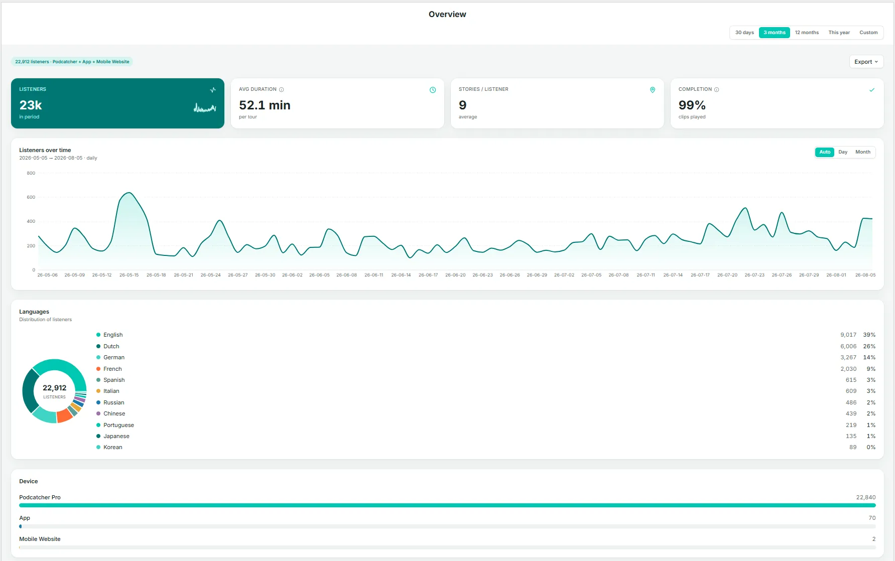
Section titled “What This Page Shows”The Overview page brings together a set of graphs and figures that summarize how your tours are performing as a whole:
- Key metrics — listeners, average duration, stories per listener, and completion
- Listeners over time
- Language distribution
- Device breakdown
Key Metrics
Section titled “Key Metrics”- Listeners — the total number of people who used a tour during the selected period.
- Avg duration — the average time spent per tour.
- Stories / listener — the average number of stories (stops) a listener plays per visit. A useful indicator of engagement depth.
- Completion — the percentage of clips played through to the end. A high completion rate generally indicates that content length and pacing are working well.
Listeners Over Time
Section titled “Listeners Over Time”A daily or monthly chart of listener volume across the selected date range. Use the Auto / Day / Month toggle to adjust the granularity.
Languages
Section titled “Languages”A donut chart and ranked list showing listener share by language. This is a condensed view of the full Languages page.
Device
Section titled “Device”A breakdown of the devices visitors used: Podcatcher Pro (dedicated hardware), App, or Mobile Website. For most venues, Podcatcher Pro accounts for the large majority of usage.
By checking the Overview page regularly, you can catch emerging trends early and decide with confidence where in Insights to focus your attention next.